Redwood branding package
Redwood Financial Advisors needed a branding package that exuded professionalism and trustworthiness while standing out in a competitive market. I was commissioned to develop a comprehensive visual identity, including the logo and a wide array of digital and physical assets.
Branding Concept:
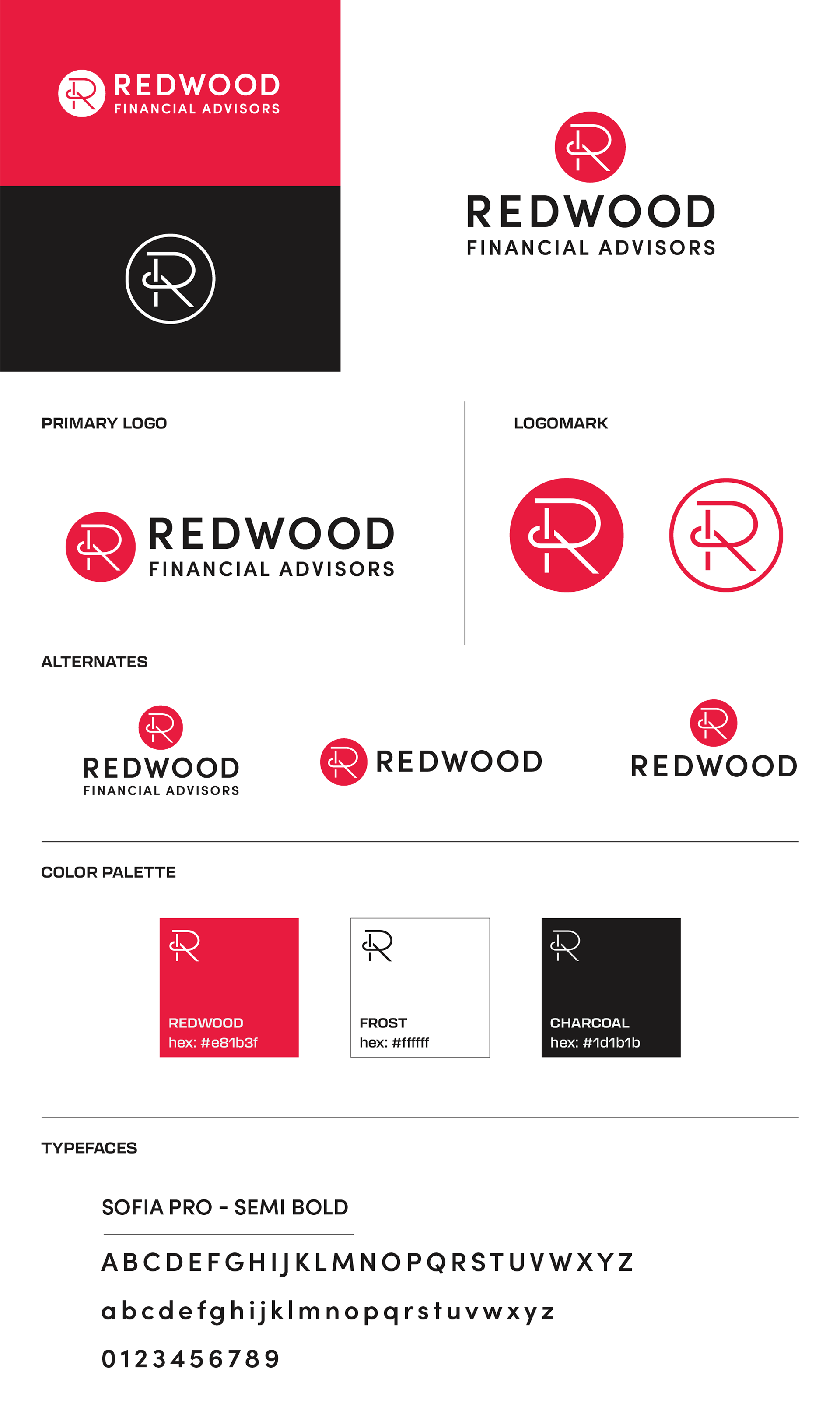
Initially, I explored a more literal approach to the name "Redwood" by designing illustration-based logos centered on the tree concept. However, after observing the managing partner’s distinctive way of writing the "R" in Redwood, I saw an opportunity to incorporate their personality into the design. This personal touch inspired the final logo, blending individuality with a clean, bold, and modern aesthetic. The bright red, black, and white color scheme further reinforces energy, sophistication, and clarity—qualities clients associate with financial expertise.
Initially, I explored a more literal approach to the name "Redwood" by designing illustration-based logos centered on the tree concept. However, after observing the managing partner’s distinctive way of writing the "R" in Redwood, I saw an opportunity to incorporate their personality into the design. This personal touch inspired the final logo, blending individuality with a clean, bold, and modern aesthetic. The bright red, black, and white color scheme further reinforces energy, sophistication, and clarity—qualities clients associate with financial expertise.
Logo Design:
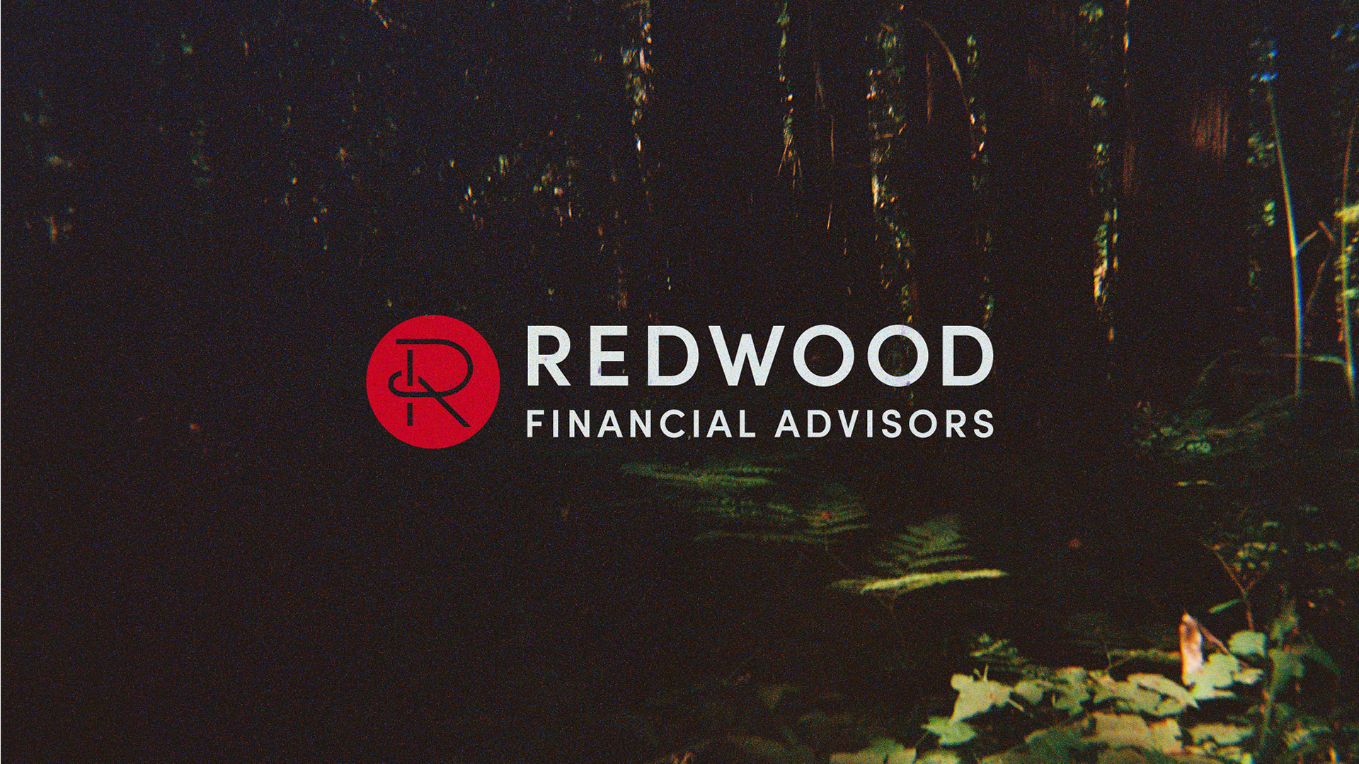
The logo focuses on the unique "R" letterform, framed within a circle to symbolize unity and balance. This design not only reflects the firm's leadership but also projects professionalism and confidence. The typography and color palette amplify the modernity and trustworthiness of the brand. Designed to be modular and scalable, the logo works seamlessly across various mediums and scales.
The logo focuses on the unique "R" letterform, framed within a circle to symbolize unity and balance. This design not only reflects the firm's leadership but also projects professionalism and confidence. The typography and color palette amplify the modernity and trustworthiness of the brand. Designed to be modular and scalable, the logo works seamlessly across various mediums and scales.
Applications:
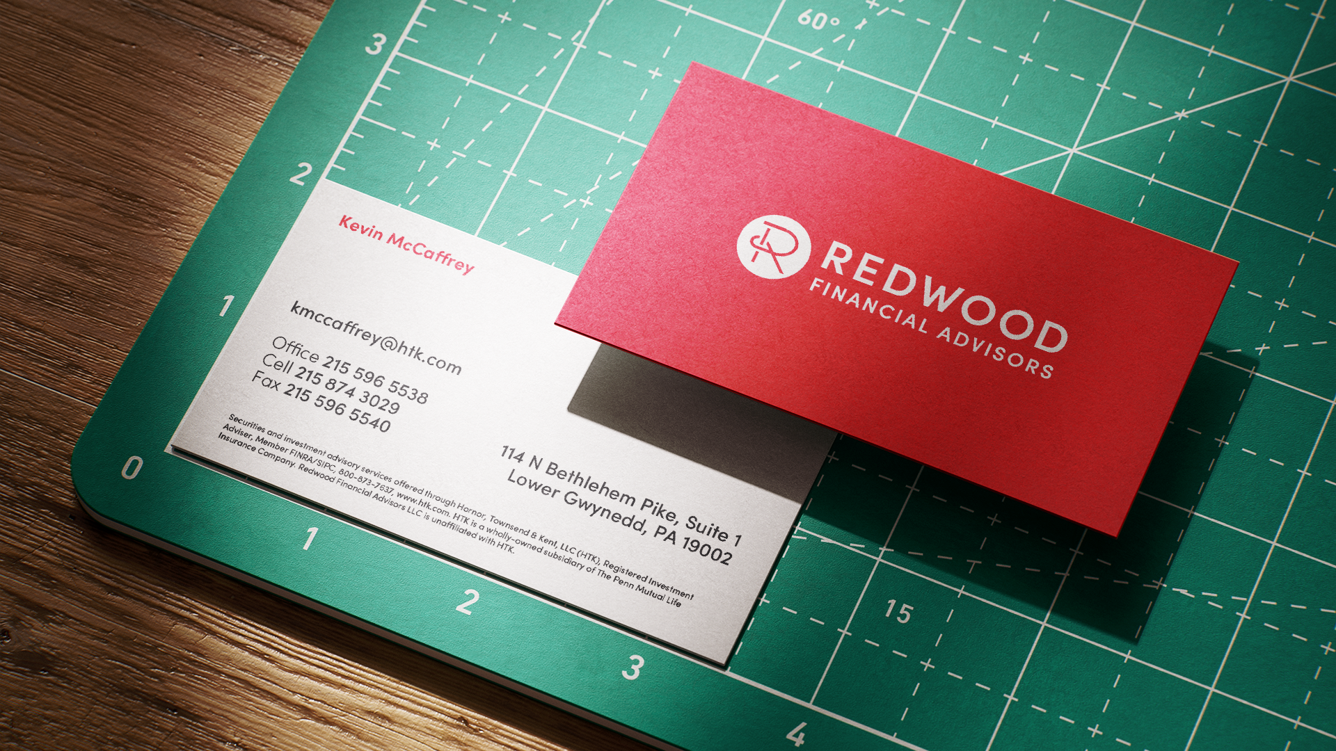
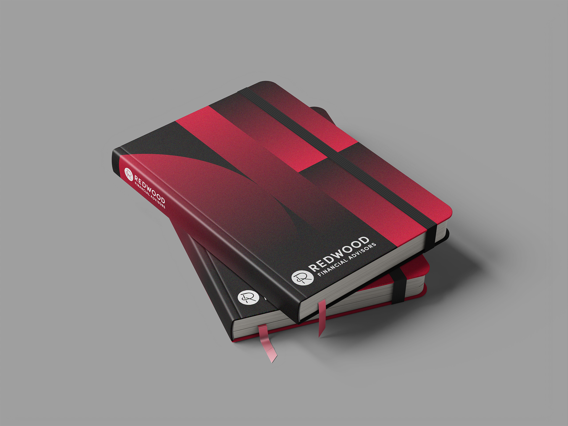
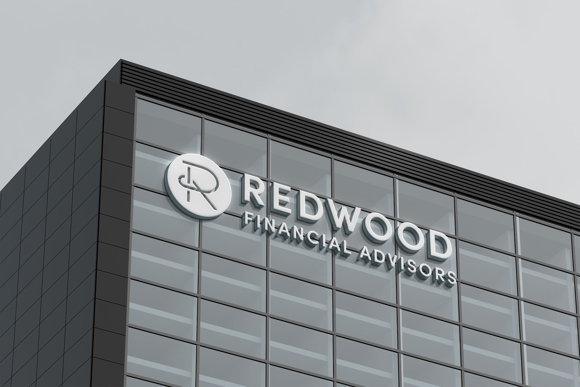
The brand identity extends cohesively across both digital and physical platforms:
The brand identity extends cohesively across both digital and physical platforms:
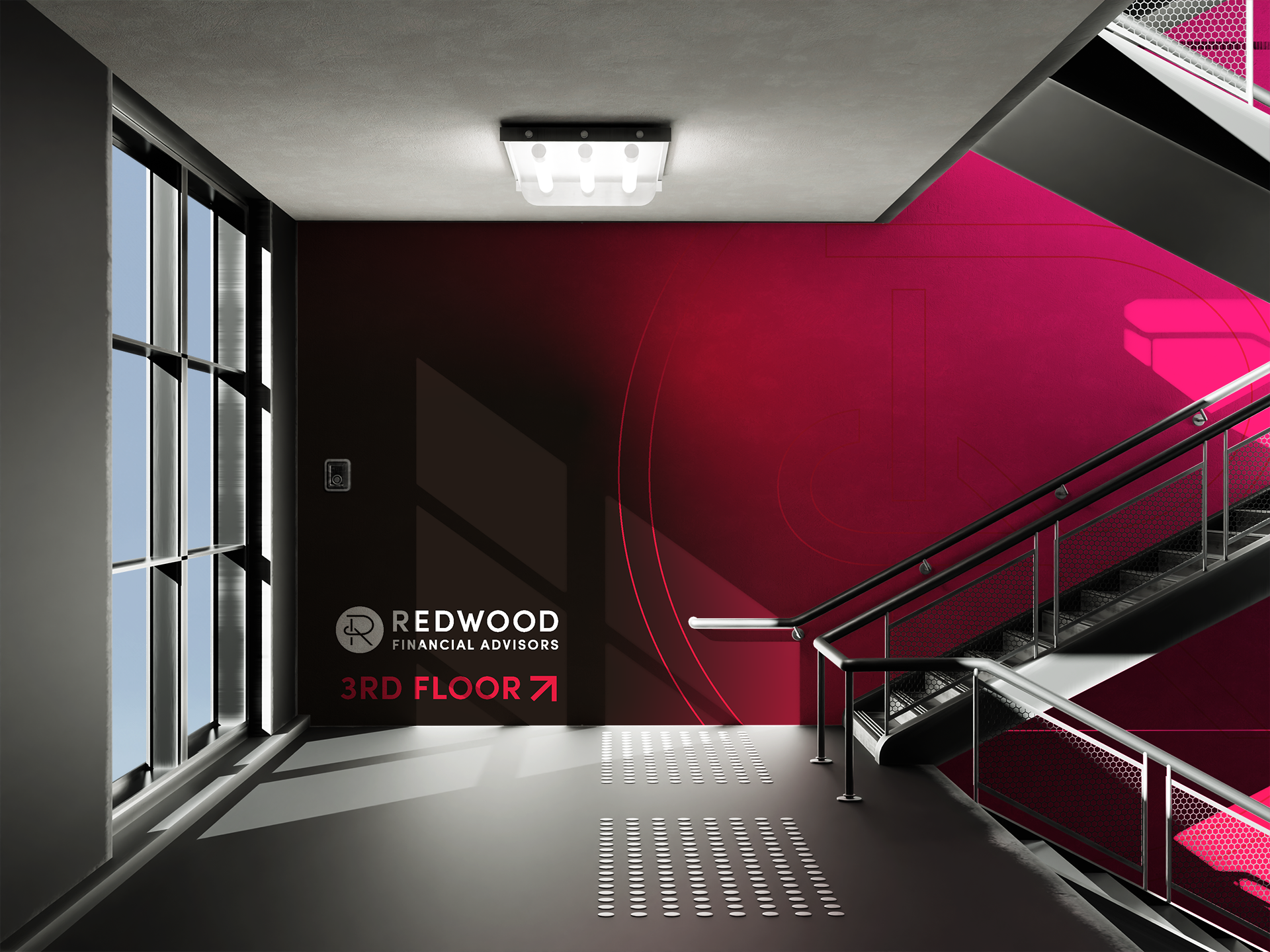
Wayfinding Design: A striking environmental application of the branding is showcased in the stairwell signage, incorporating the logo and brand colors to guide and engage clients.
Print Collateral: Business cards, employee badges, and stationery maintain a consistent, professional tone while leveraging the bold color palette.
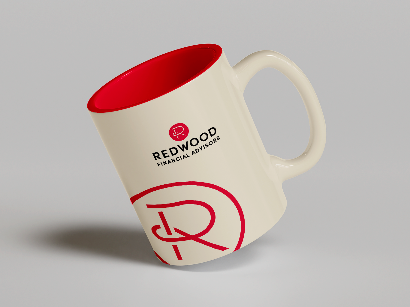
Merchandise: Branded items, such as notebooks and mugs, reinforce the identity in both client-facing and internal contexts.
Outcome:
The final branding captures the essence of Redwood Financial Advisors: a modern, client-focused firm with deep roots in stability and growth. By integrating the managing partner’s personality into the logo, the brand feels personal yet polished, fostering trust and connection with its audience.
The final branding captures the essence of Redwood Financial Advisors: a modern, client-focused firm with deep roots in stability and growth. By integrating the managing partner’s personality into the logo, the brand feels personal yet polished, fostering trust and connection with its audience.


Annual Christmas Cards
Every year we design a fun and different Christmas card which is a very special project to the business and to me. It strays from the branding while keeping just enough of a connection to feel recognizable and memorable.