Petro's bread rebrand
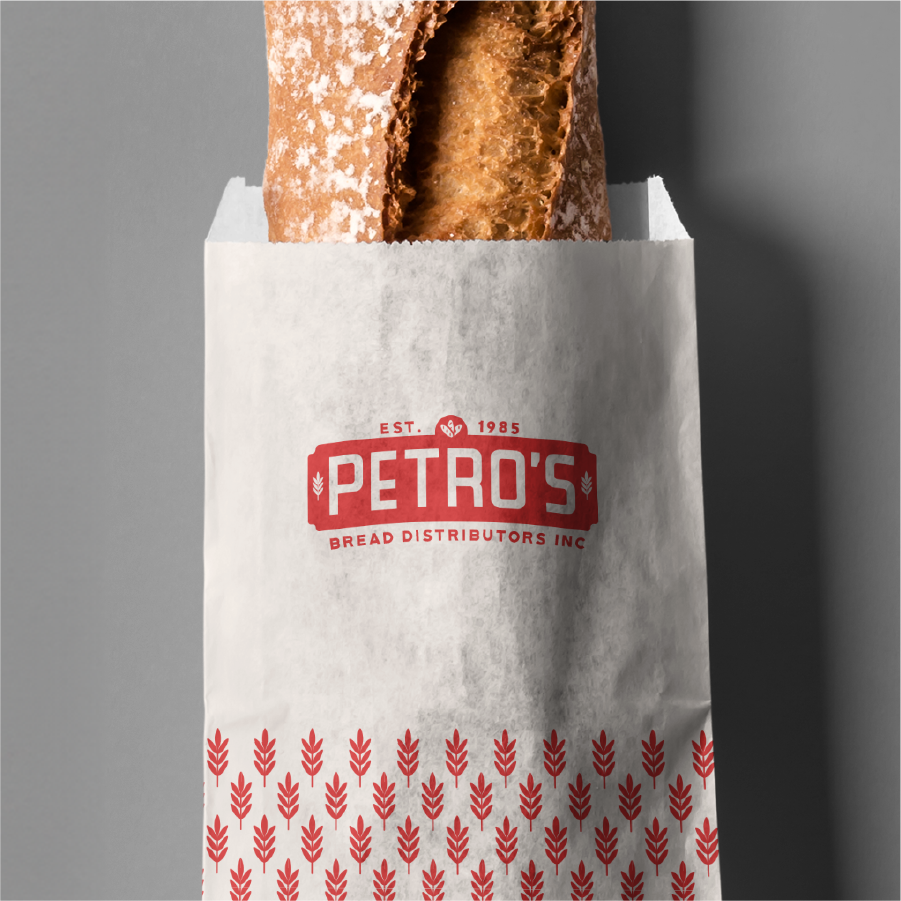
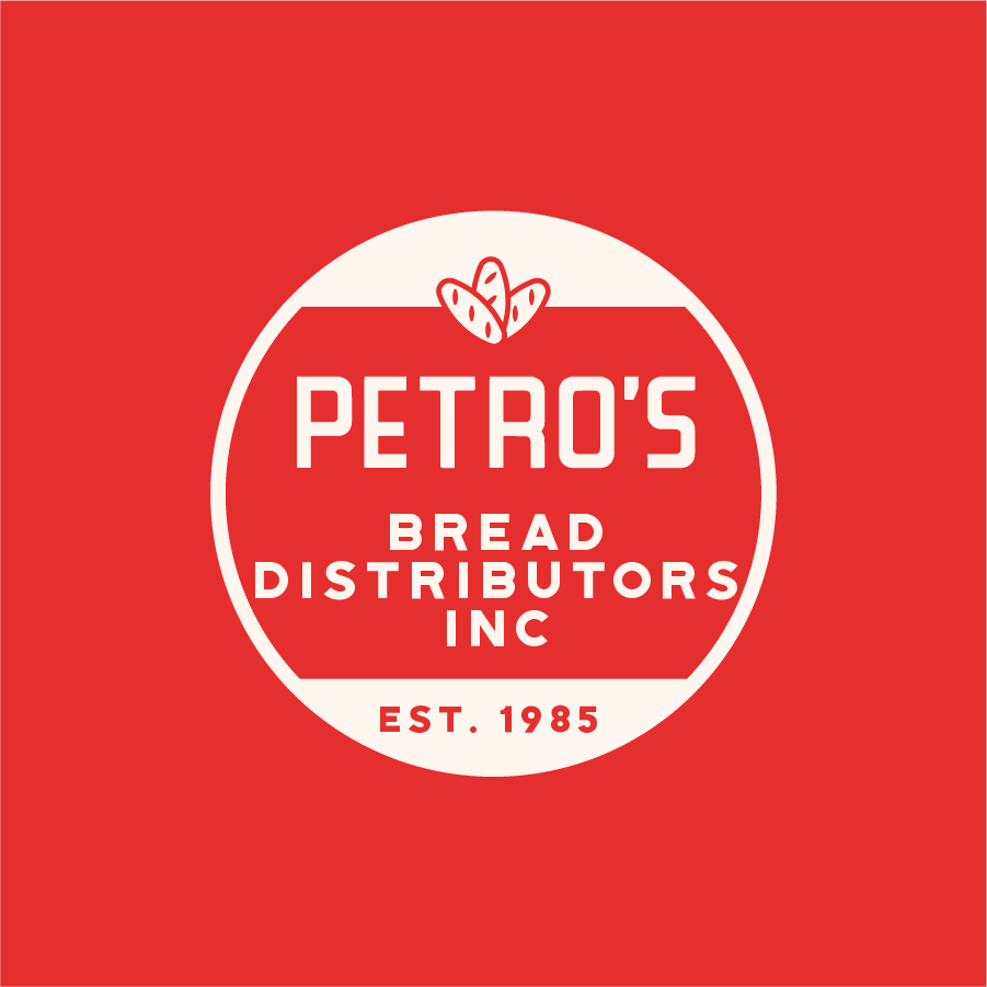
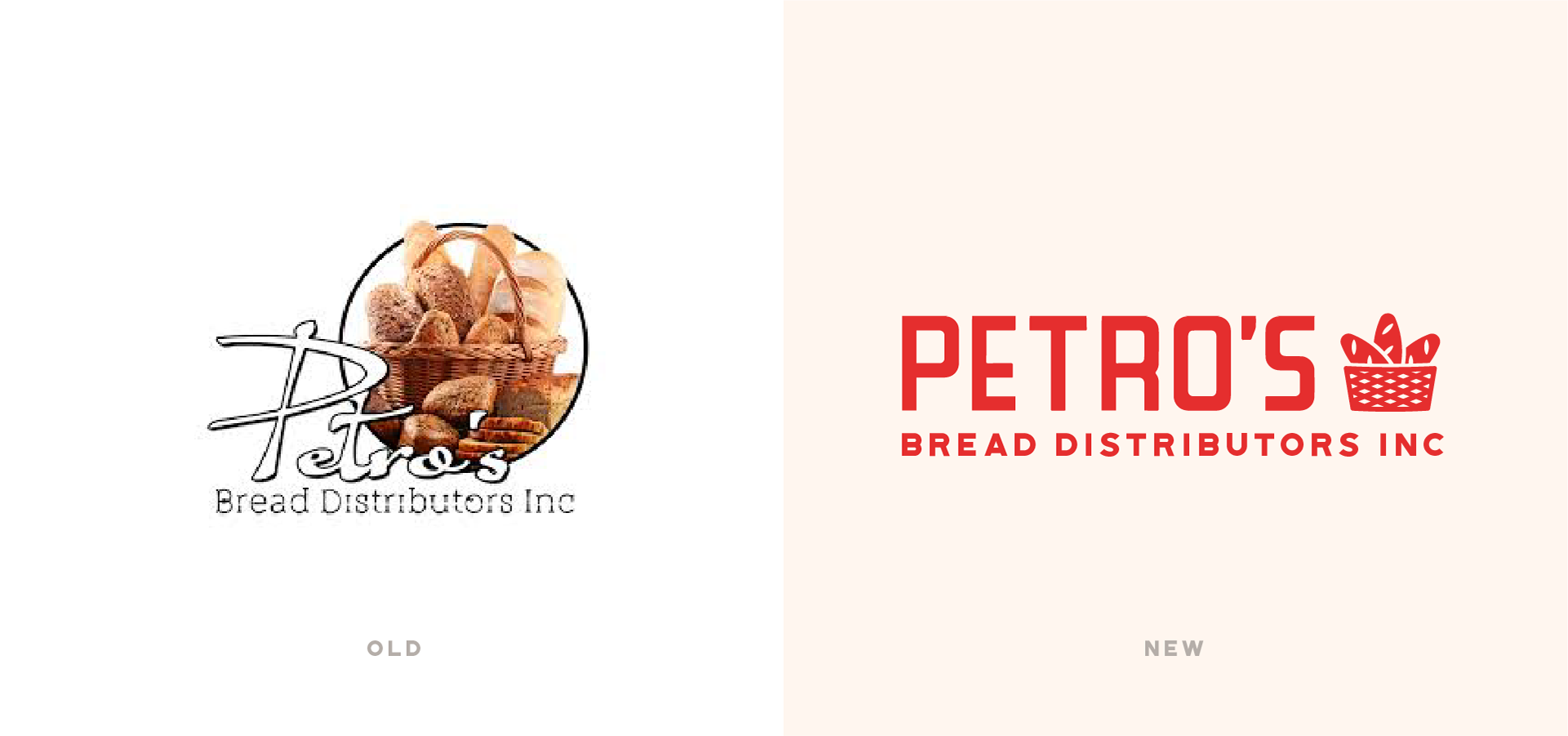
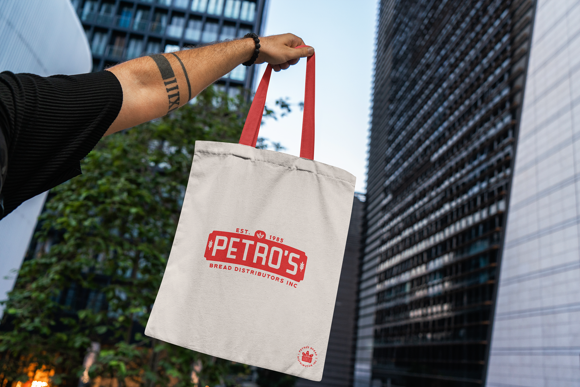
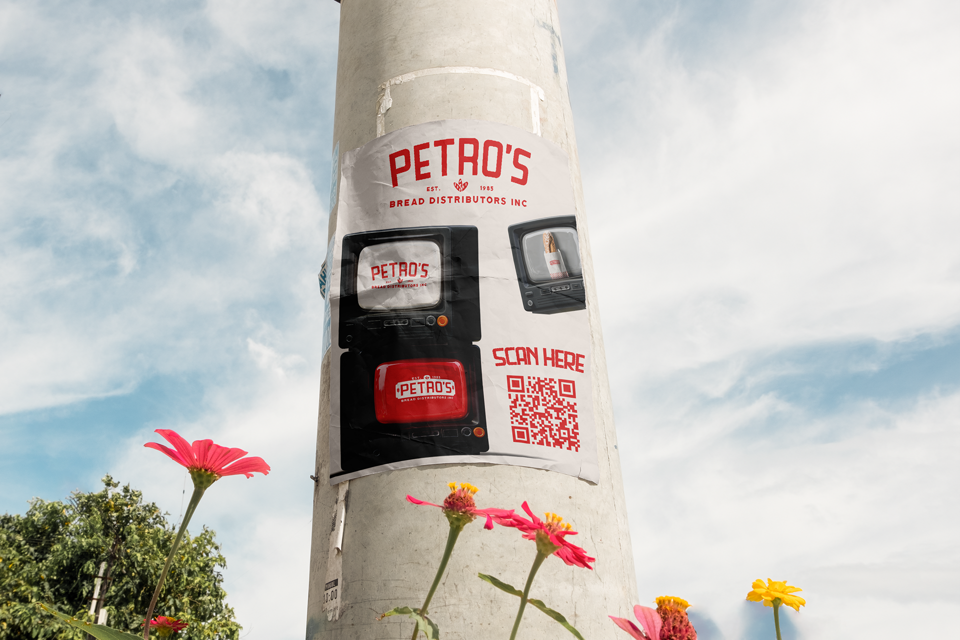
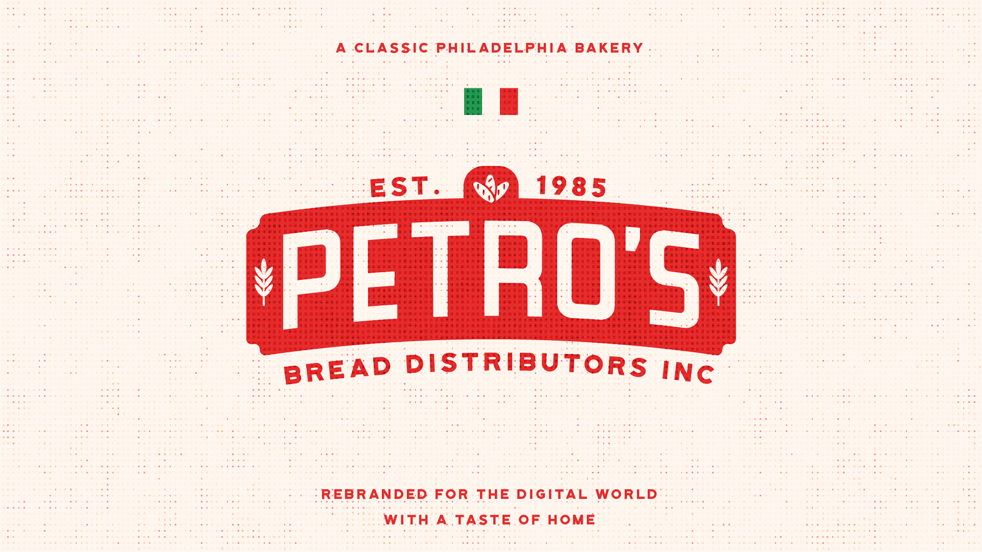
Petro’s Bread Distributors, a family-run Philadelphia bakery spanning three generations, came to me with a strong heritage but a lack of visual cohesion in their branding. My goal was to craft a visual identity that honored their rich history while creating a brand that felt authentic, trustworthy, and timeless. Drawing from classic Italian packaging design, I leaned into the family’s Italian-American roots to create something both familiar and welcoming. The final design reflects the warmth and legacy of a family business while modernizing the brand for today’s market.
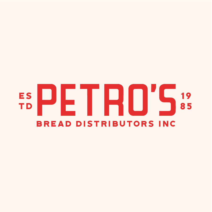
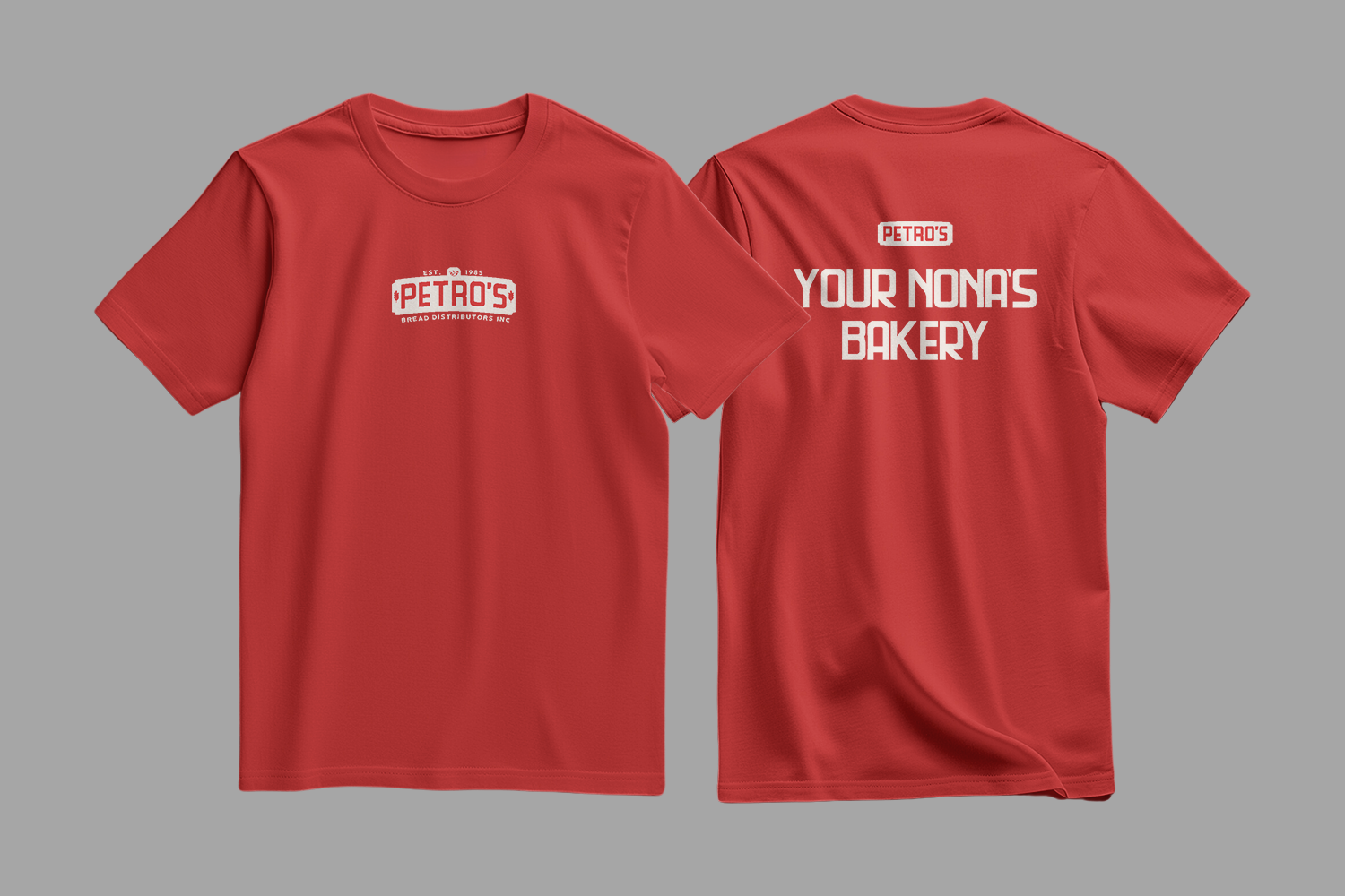
The centerpiece of the rebrand is a logo system that balances tradition and functionality. I incorporated subtle bread imagery as a nod to their craft but kept the focus on the Petro’s name—something their loyal customers already know and trust. The system was built with versatility in mind, working seamlessly across a variety of applications, from large-scale environmental designs to small digital assets, while maintaining a cohesive visual style. Through this project, Petro’s now has a brand that’s as enduring as its family legacy.