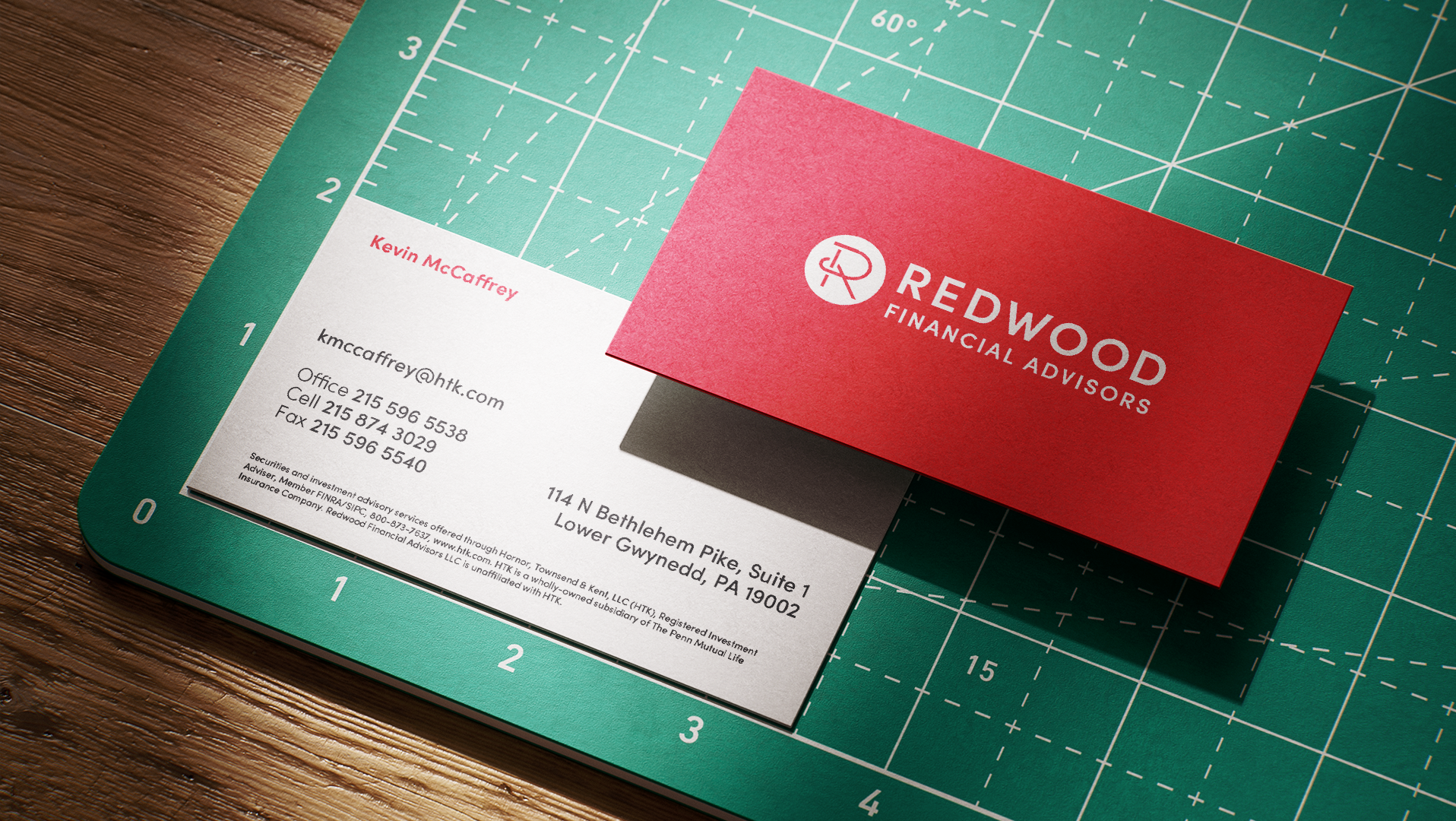
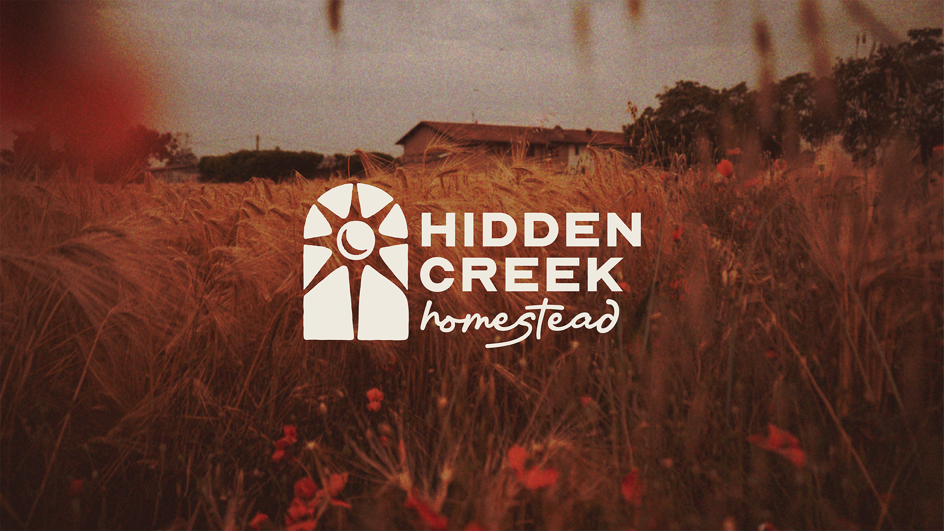
Hidden Creek Homestead: branding package
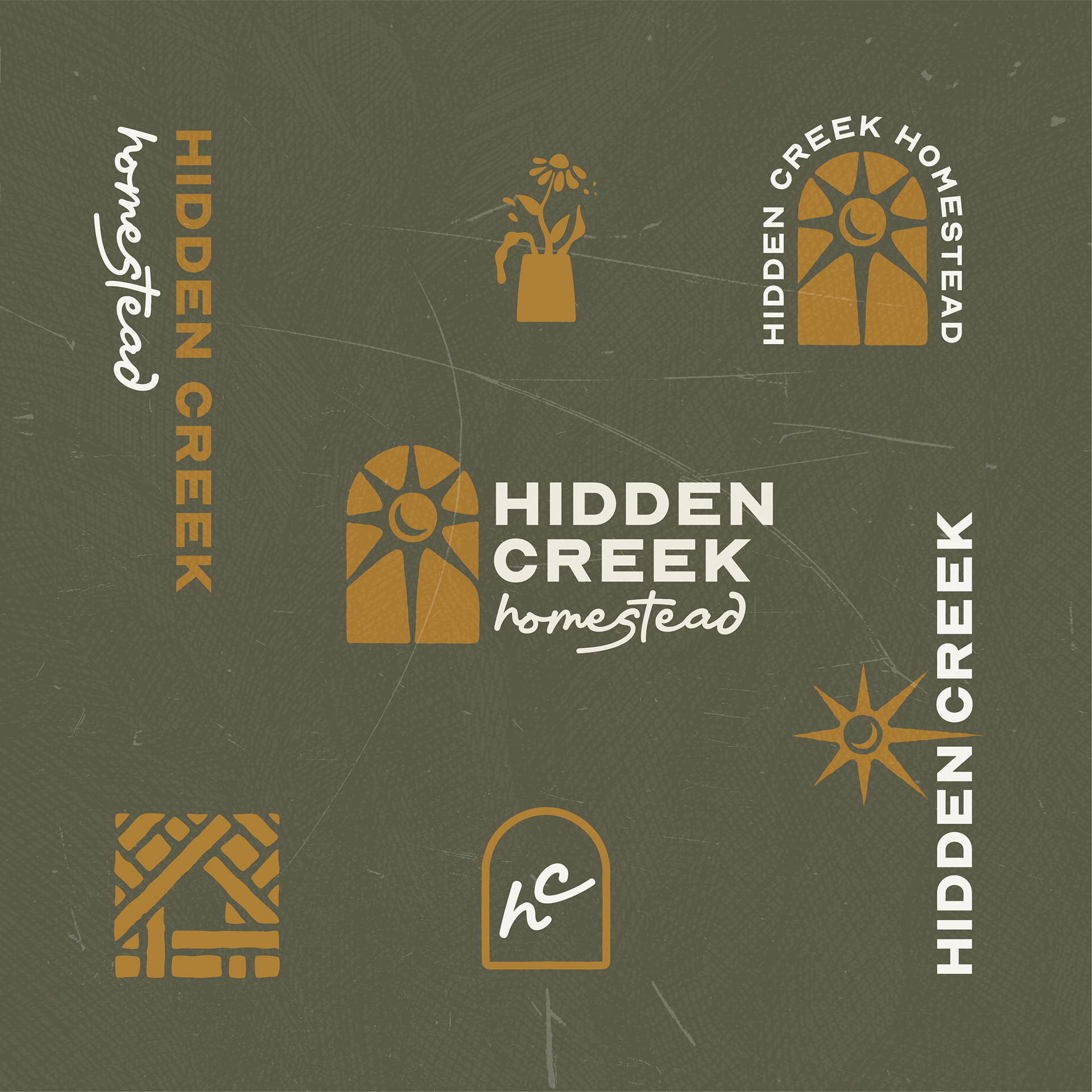
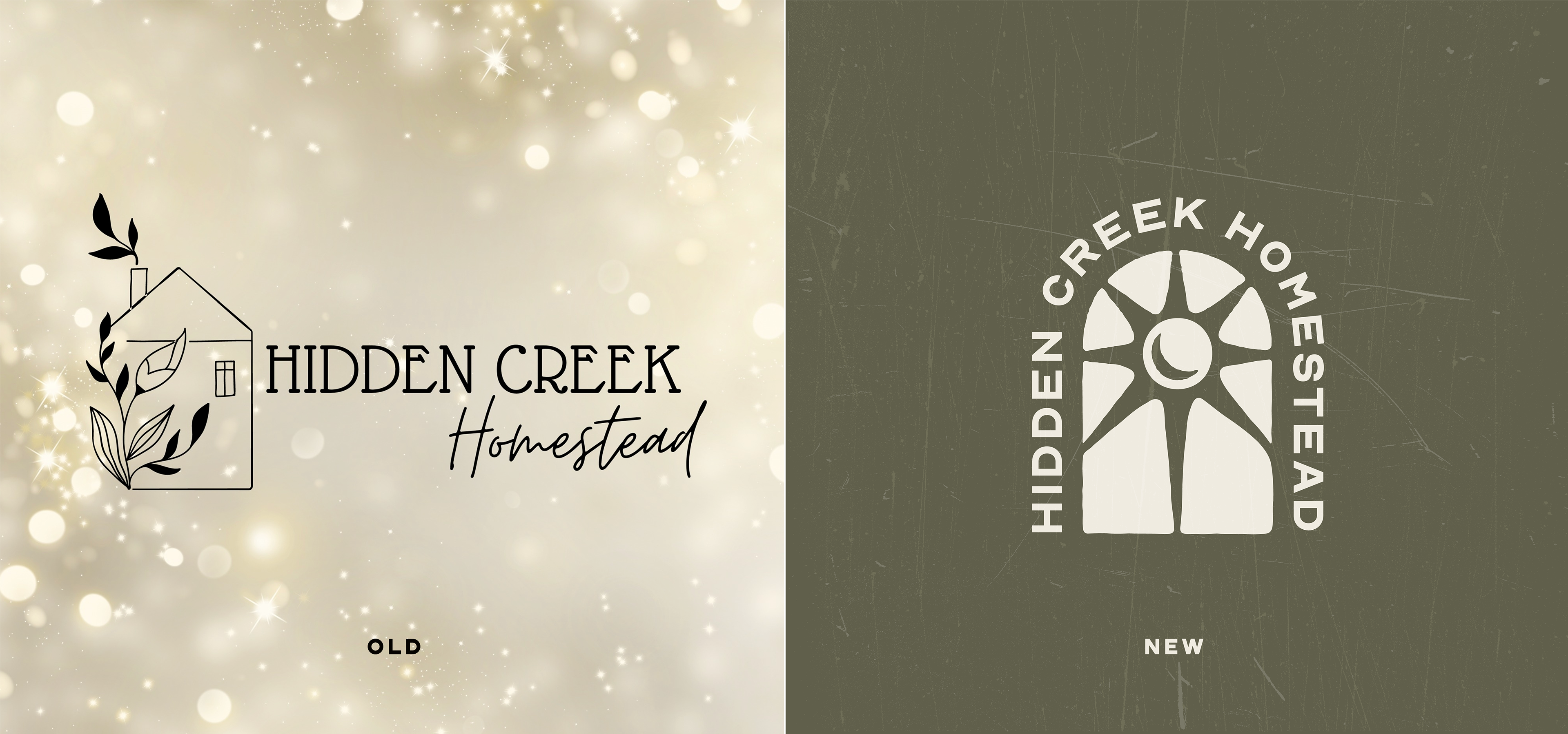
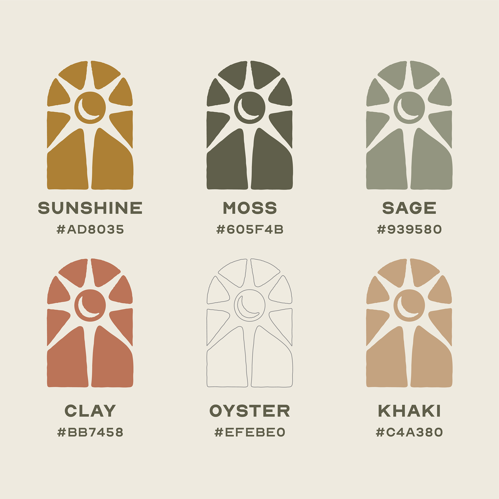
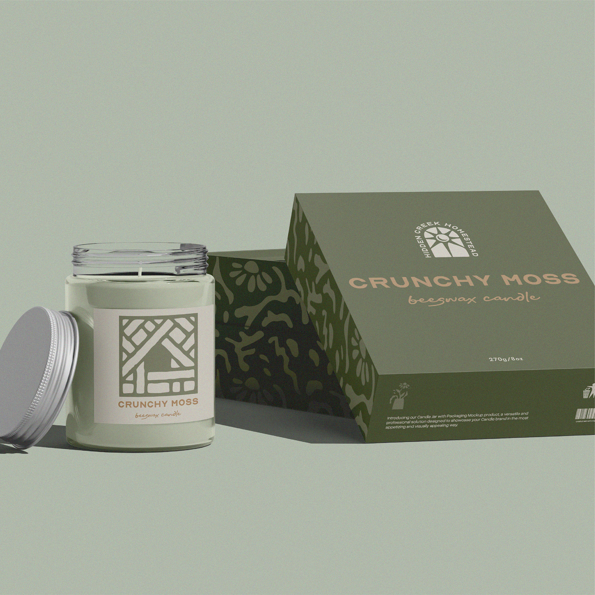
The brand identity and logo design for Hidden Creek Homestead reflect the brand's sustainable ethos with a fun, natural, and clean aesthetic. The central logo is inspired by the arched windows of the homestead in Missouri, incorporating versatile symbols like a sunrise, moonrise, or flower pot, which can appear through negative space or as standalone icons. This thoughtful approach ensures the design feels authentic to the family-run business while evoking a warm, inviting vibe.
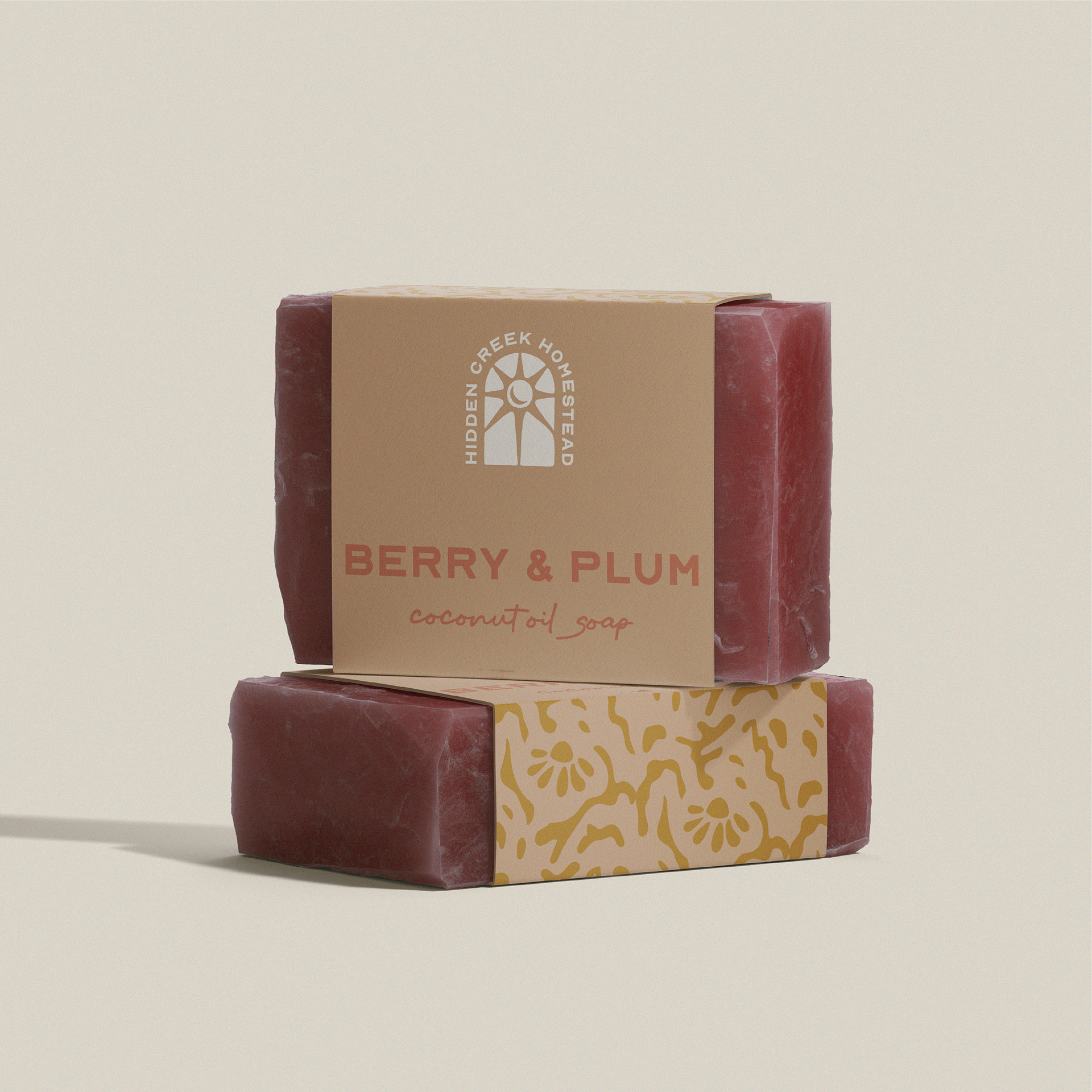
The modular nature of the logo allows for seamless adaptation across various applications, from candle and soap packaging to branded swag. By prioritizing flexibility in the design, the branding system can meet the diverse needs of the client while maintaining consistency and cohesion. This versatility highlights how intentional design empowers a brand to grow and evolve while staying true to its roots.


Clothing Line: Fall drop
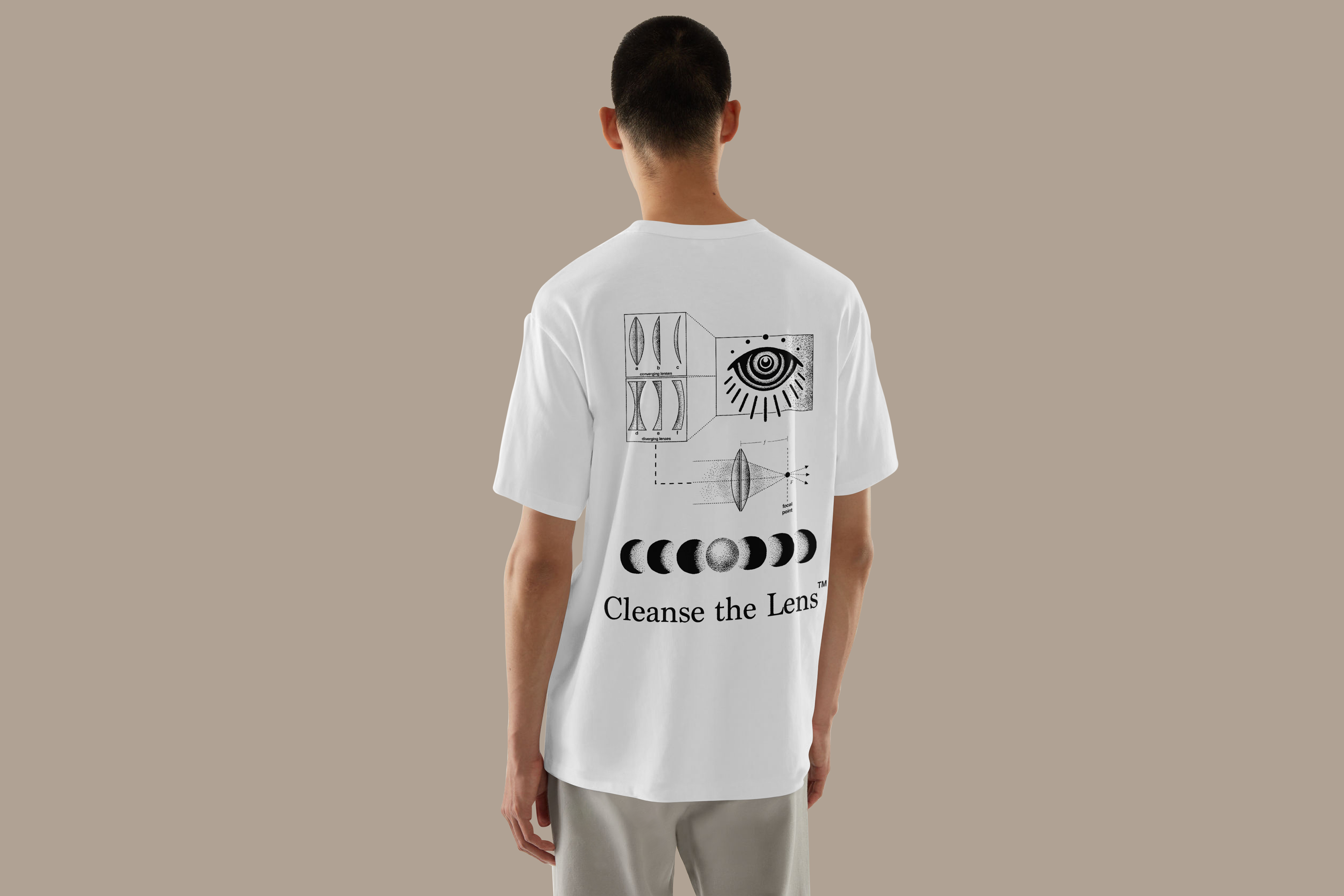
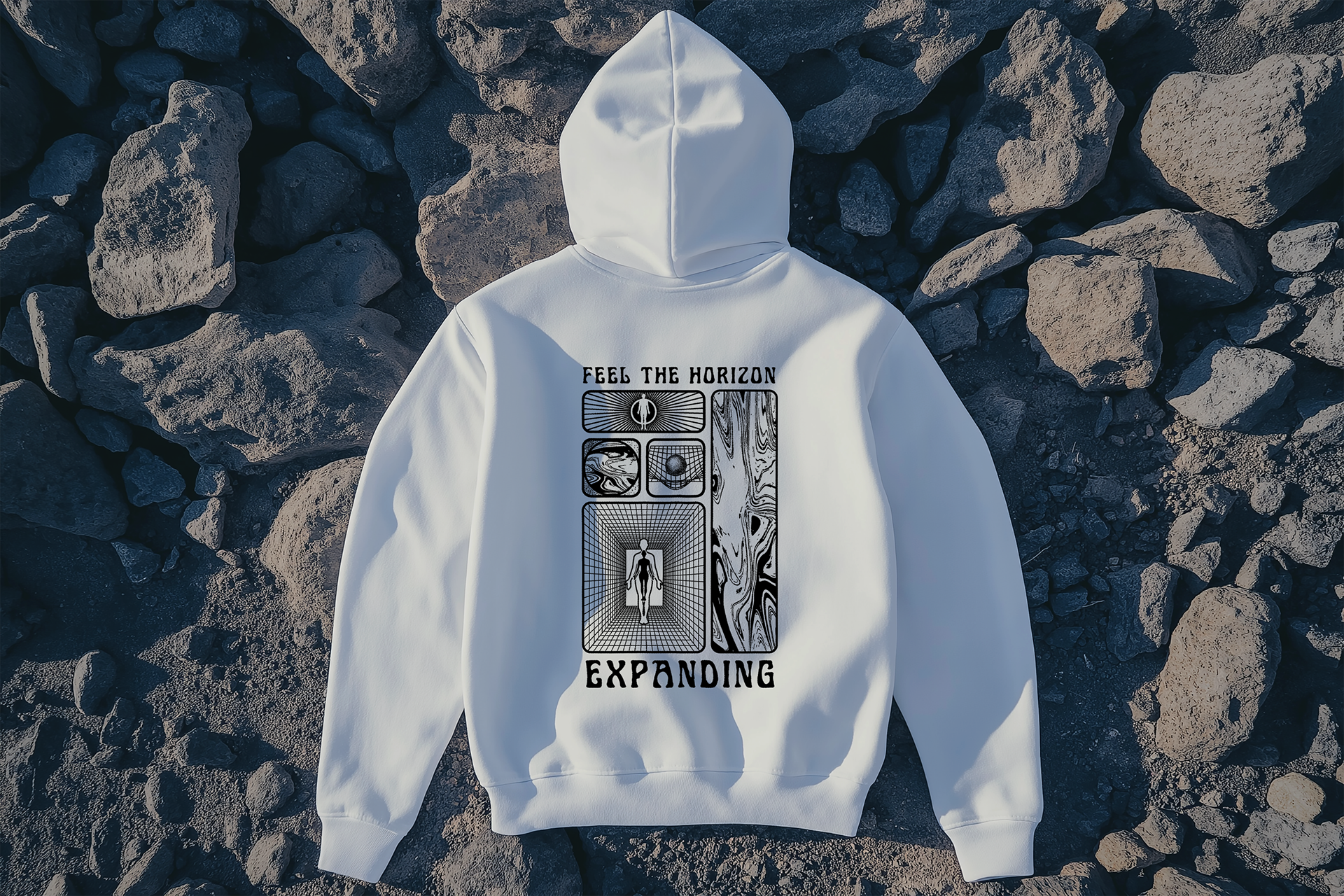
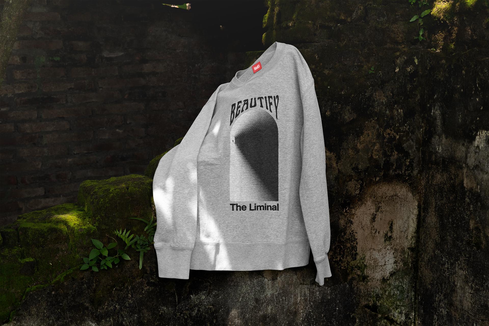
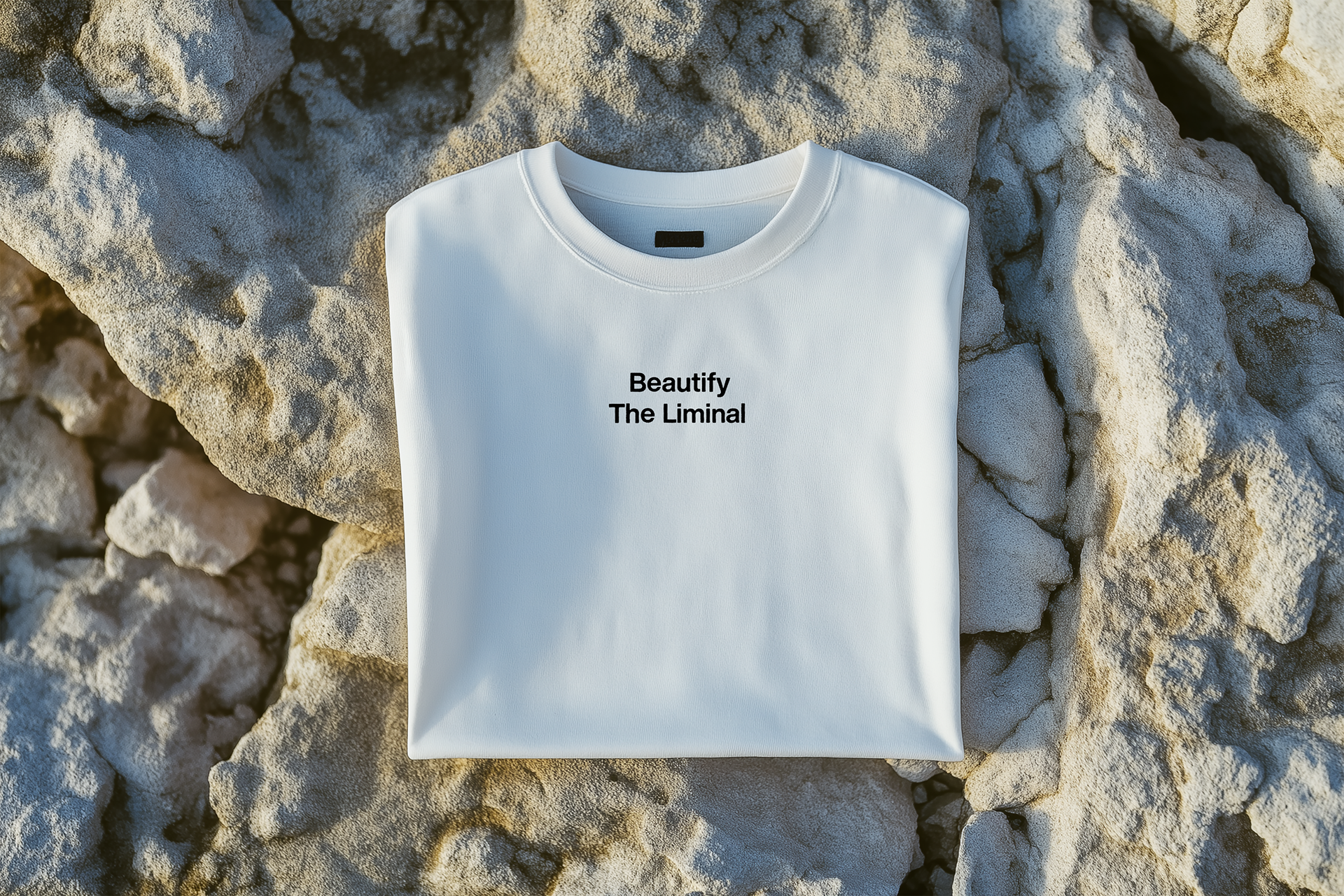
As a continuation of my work with this brand, I created a series of three streetwear-inspired t-shirt and hoodie designs. These pieces embody a Y2K-meets-mystical aesthetic, with detailed black-and-white illustrations that evoke a sense of exploration and intrigue. Each design integrates thematic elements from the brand, such as transformation, perception, and the beauty of the natural world.
The artwork combines bold symbolism with intricate linework, ensuring versatility for both wearability and storytelling. From cosmic perspectives to liminal spaces, the graphics encourage viewers to engage with the designs on a deeper, almost meditative level. These shirts represent the brand’s evolution into wearable art that resonates with their community.